A design concept for a twelve-room hill-country hotel in Ella. The aim: move guests from booking platforms to direct bookings, with a photo-led, room-first layout and a three-step booking flow.
Client
Mist & Pine Boutique Hotel
Location
Ella, Sri Lanka
Year
2026
Role
UX research, UI design, prototype
Services
UX research, UI design, Booking flow design, Clickable prototype
12
Rooms
3
Booking steps
2
Currencies
Overview
Project overview
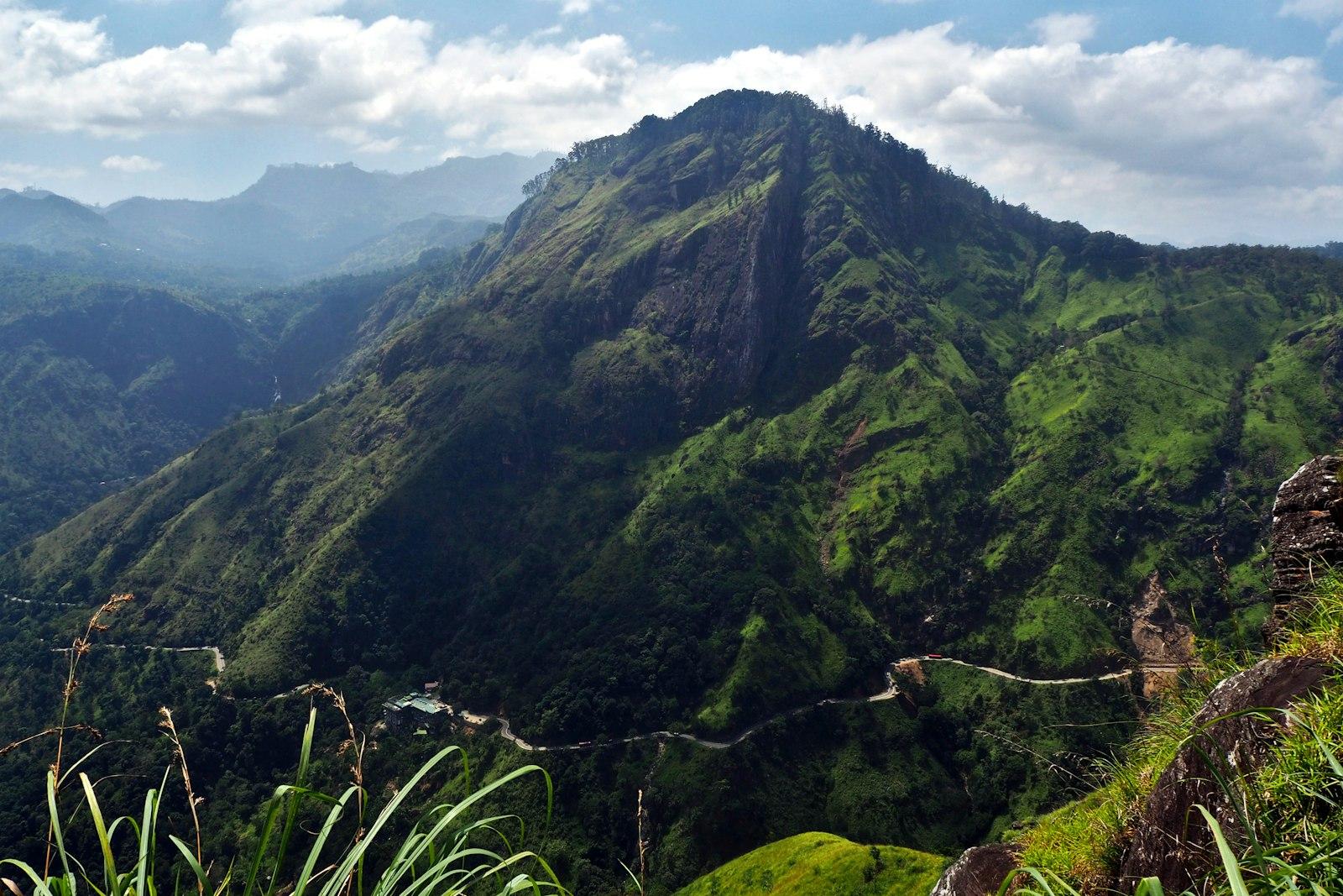
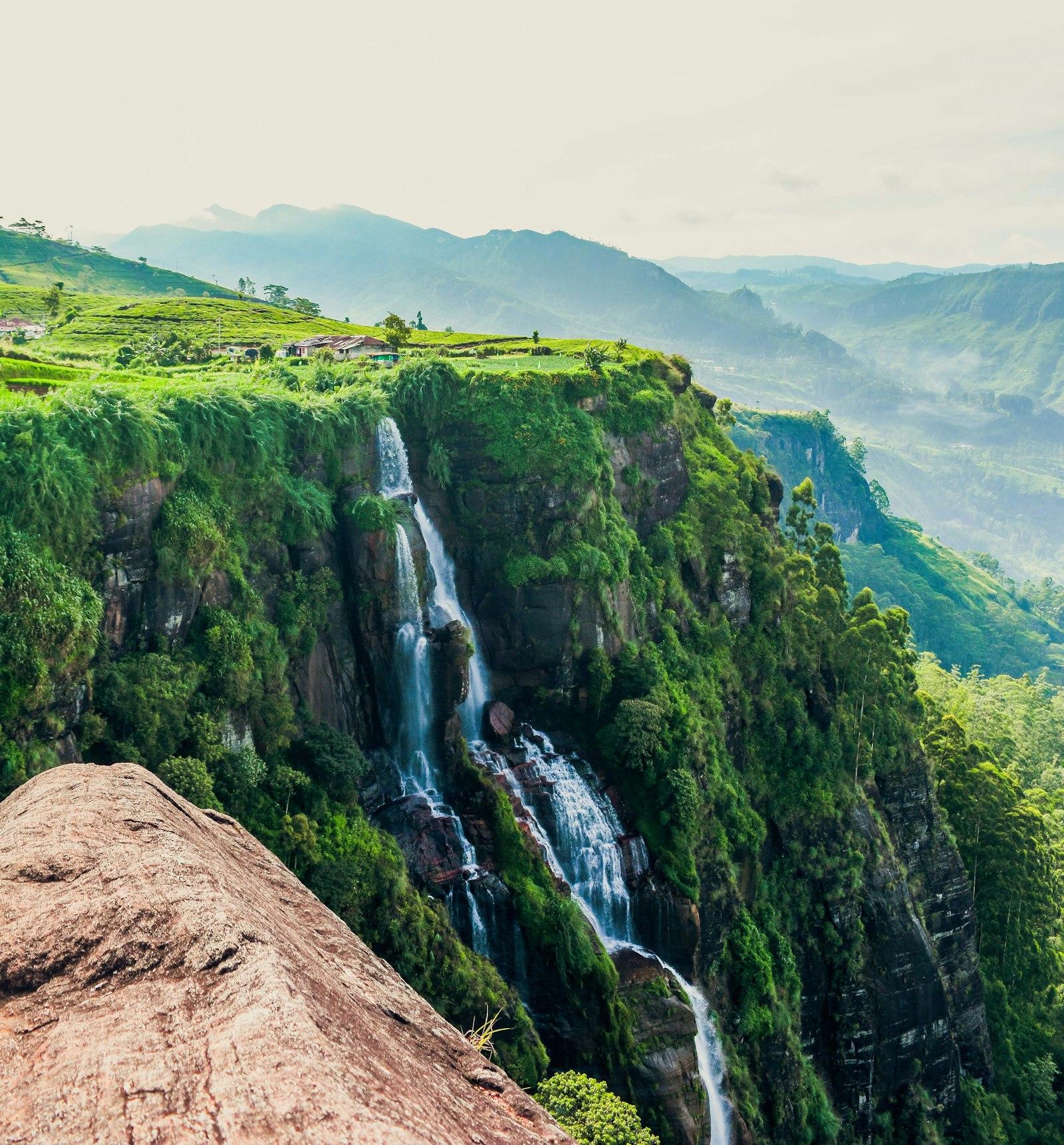
Ella is one of the most visited places in Sri Lanka's hill country: the Nine Arches Bridge, Little Adam's Peak and the train from Kandy bring thousands of travellers through every week. Most of them book their stay on large booking platforms, and small hotels pay a commission on every one of those nights.
Mist & Pine is a concept for a twelve-room boutique hotel on a tea-estate ridge above the town. We designed its website from the ground up — research, structure, visual design and a clickable prototype — around one goal: when a guest finds the hotel, booking directly should feel easier and better value than going back to a platform.
This is a design project. Everything was designed and prototyped in Figma; it has not been built as a live website.
The challenge
Business challenge
Small hotels in Ella lose a large share of every booking to platform commission. Guests often find the hotel on a platform, then search for its own site, and leave if that site is slow, has no prices, or makes booking unclear.
Goals
- 01
Show the place within the first second: the view, the altitude, the feeling of waking above the clouds.
- 02
Put real prices on every room page, in LKR and USD, so guests never have to 'enquire' to find out.
- 03
Make booking direct three steps long, with no account and no surprises.
- 04
Give guests a clear, honest reason to book direct instead of through a platform.
Audience
Who we designed for
International travellers
Planning a Sri Lanka route on a phone, comparing a few hotels in each town. They want photos, prices and location, fast.
Local weekenders
Colombo couples and families escaping the heat. They book late, often on a Thursday, and care about value and a good breakfast.
Returning guests
Already know the hotel and just want to rebook their favourite room without starting from scratch.
Research
Key insights
- 1
Guests who found the hotel on a platform still visit its own website to 'check it's real' — that visit is the moment to win the direct booking.
- 2
The most common questions are practical: how to get there from the station, whether there's hot water, and how steep the walk is. They belong on the page, not in an email.
- 3
Room photos sell rooms, but the view sells the hotel. The homepage leads with landscape; room pages lead with the room.
- 4
Many guests message on WhatsApp before booking. A visible WhatsApp button reduces drop-off rather than distracting from booking.
Approach
Our approach
- 01
Lead with the place: a full-bleed photo of the hills, the altitude and the walk to Nine Arches, then rooms with real prices in LKR and USD.
- 02
A booking bar sits over the hero and is pinned on every room page. Dates, guests, room — three steps, no account needed.
- 03
A WhatsApp concierge button for the questions guests actually ask: tuk-tuk pickup, early check-in, the train.
- 04
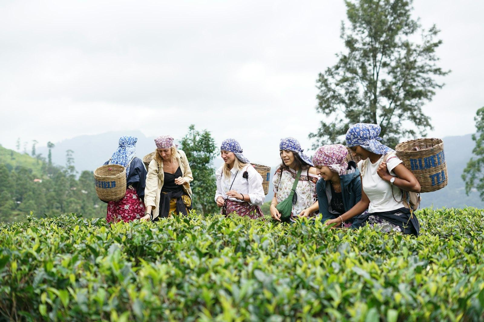
A short local guide (walks, trains, tea estates) written as editorial pieces, which also helps the site appear in search.
Screens
Rooms & booking
Mobile home
Palette
Forest
#1F3A2E
Clay
#C9733E
Fern mist
#DDE4DA
Night
#15241C
Display
Fraunces
Body
Inter
Design decisions
Design rationale
Photography first
Full-bleed landscape on the homepage, tight room photos on room pages. The interface stays quiet so the photos carry the mood.
Forest and clay
A deep forest green for structure and a warm clay accent taken from the sunset light, used only for the booking actions.
Serif for the voice
Fraunces for headlines gives a calm, editorial feel; Inter keeps prices, dates and forms crisp and readable.
Honest comparison
Instead of a vague 'best price guarantee', the booking panel lists exactly what booking direct adds: breakfast and a late checkout.
What we designed
Key capabilities
01
Room-first pages
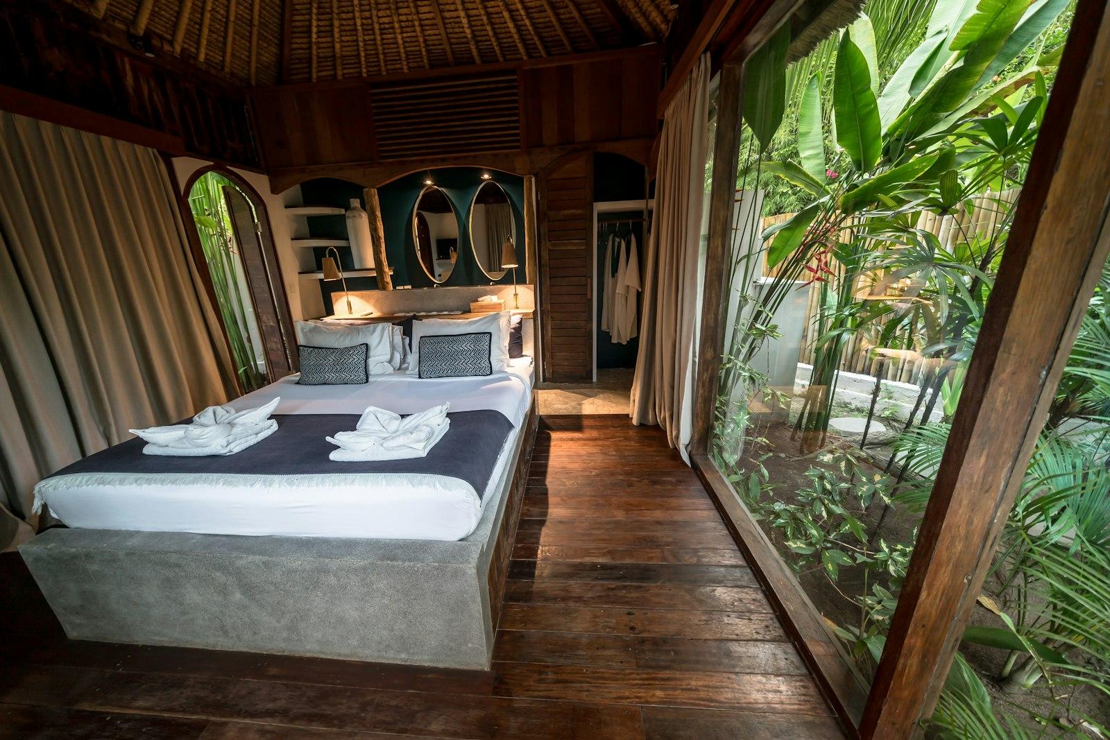
Each room gets its own page with size, view, bed type and a live price for the chosen dates.
02
Three-step booking
Dates, guests and room, then pay a deposit. Designed to work on a phone with one hand.
03
Local guide
Walks, trains and tea estates nearby, written as short editorial pieces for search.
04
Direct-booking perks
A clear, honest comparison: book here for free breakfast and a late checkout.
05
WhatsApp concierge
A floating button that opens a chat with the front desk, with the dates already filled in.
06
Getting here
Step-by-step directions from Ella station and the Colombo road, with tuk-tuk prices.
Deliverables
Project deliverables
- A complete, clickable prototype covering the homepage, room pages, the three-step booking flow and the local guide, on desktop and mobile.
- A small design system — colours, type, buttons, booking components — ready to hand to a developer.
Lessons learned
For hospitality, the booking form is part of the brand. A calm, simple form says as much about the hotel as the photos do.
Answering practical questions on the page builds more trust than any amount of marketing copy.
Design concept: a self-initiated UI/UX study, designed and prototyped in Figma. The business and its details are illustrative.
Next project
03 / Restaurant website design
Kadé