A fully built, self-initiated app for a fictional Colombo coffee chain with three cafés: order ahead, skip the queue, and earn points towards a free coffee. It ships as an iOS and Android app, a web version of the same app, and a one-page marketing site.
Client
Ceylon Brew Coffee
Location
Colombo, Sri Lanka
Year
2026
Role
Product design, mobile and web development
Services
Mobile app, UX & UI design, Landing page, Design system
3
Platforms: iOS, Android, web
24
Menu items
AA
Contrast, light and dark
Overview
Project overview
Ceylon Brew is a self-initiated project: a specialty coffee chain with three cafés in Colombo — Kollupitiya, Cinnamon Gardens and Nugegoda — built to show how a local café brand could compete with the big international chains on convenience and loyalty.
We designed and built the full product: an order-ahead and loyalty app for iOS and Android, a web build of the same app, and a one-page marketing site that uses real screenshots of the app. The menu, cafés and accounts run on a realistic mock API, ready to be swapped for a real backend.
The café and its details are fictional, but the app is real: you can install it, sign in with a one-time code, customise a drink, place an order and watch it move from received to ready.
The challenge
Business challenge
Morning queues at busy Colombo cafés cost both sides: customers wait, and baristas juggle orders at the till. The goal was an app that lets regulars order from the office, collect on arrival and feel rewarded for coming back.
Goals
- 01
Let a regular reorder their usual drink in two taps.
- 02
Make loyalty visible and motivating: always show how close the next free coffee is.
- 03
Show exactly when an order will be ready, so nobody waits at the counter.
- 04
Ship one codebase to iOS, Android and the web without it feeling like a compromise on any of them.
Audience
Who we designed for
Office regulars
Order the same flat white most mornings and want it ready the moment they walk in.
Weekend visitors
Browse the menu, try the seasonal special, and care about vegan and gluten-free options.
Loyal fans
Collect stamps and points, climb the tiers, and like being recognised for coming back.
Research
Key insights
- 1
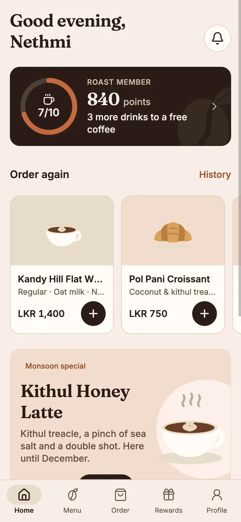
Most coffee orders are repeats. 'Order again' belongs at the top of the home screen, above the menu.
- 2
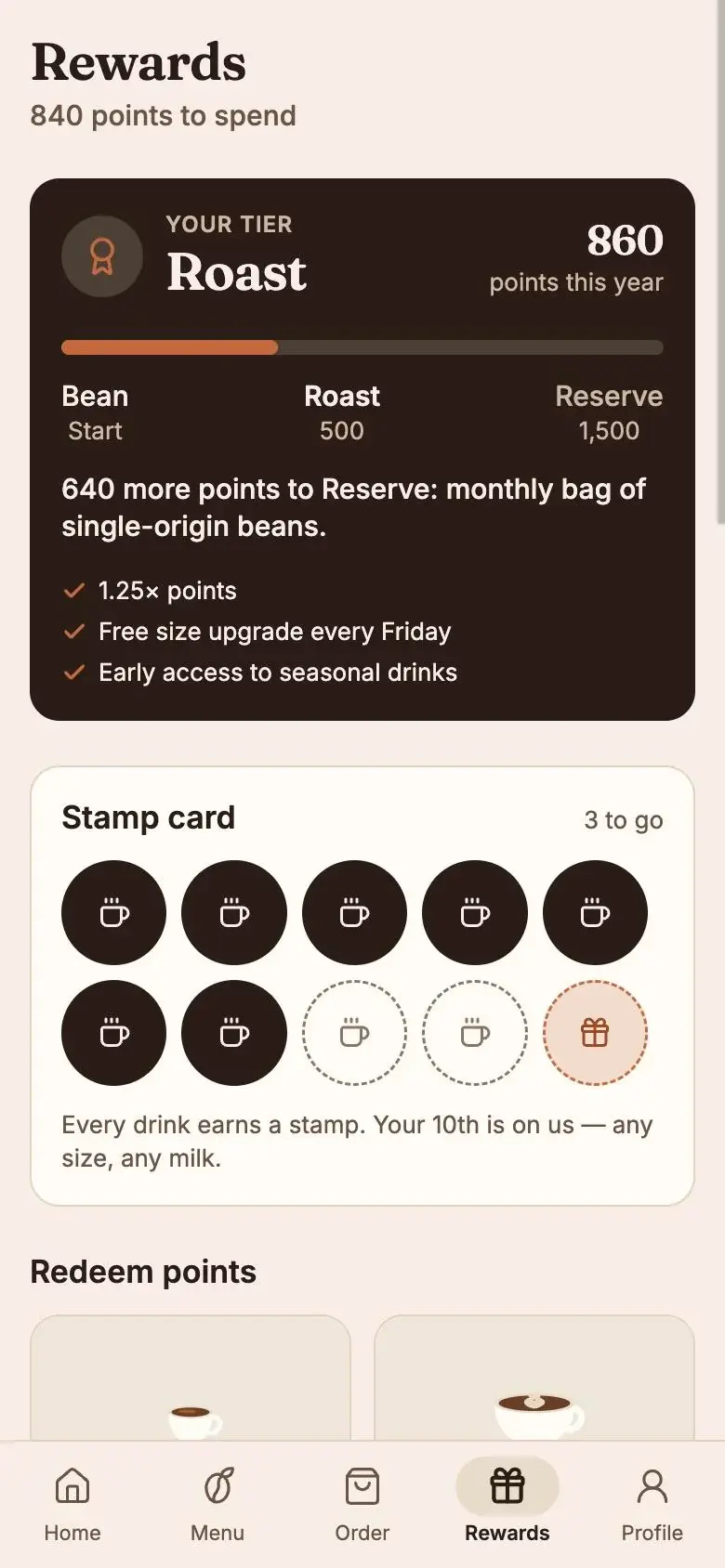
A loyalty card only works if people can see their progress. A ring with 7/10 stamps is more motivating than a points number alone.
- 3
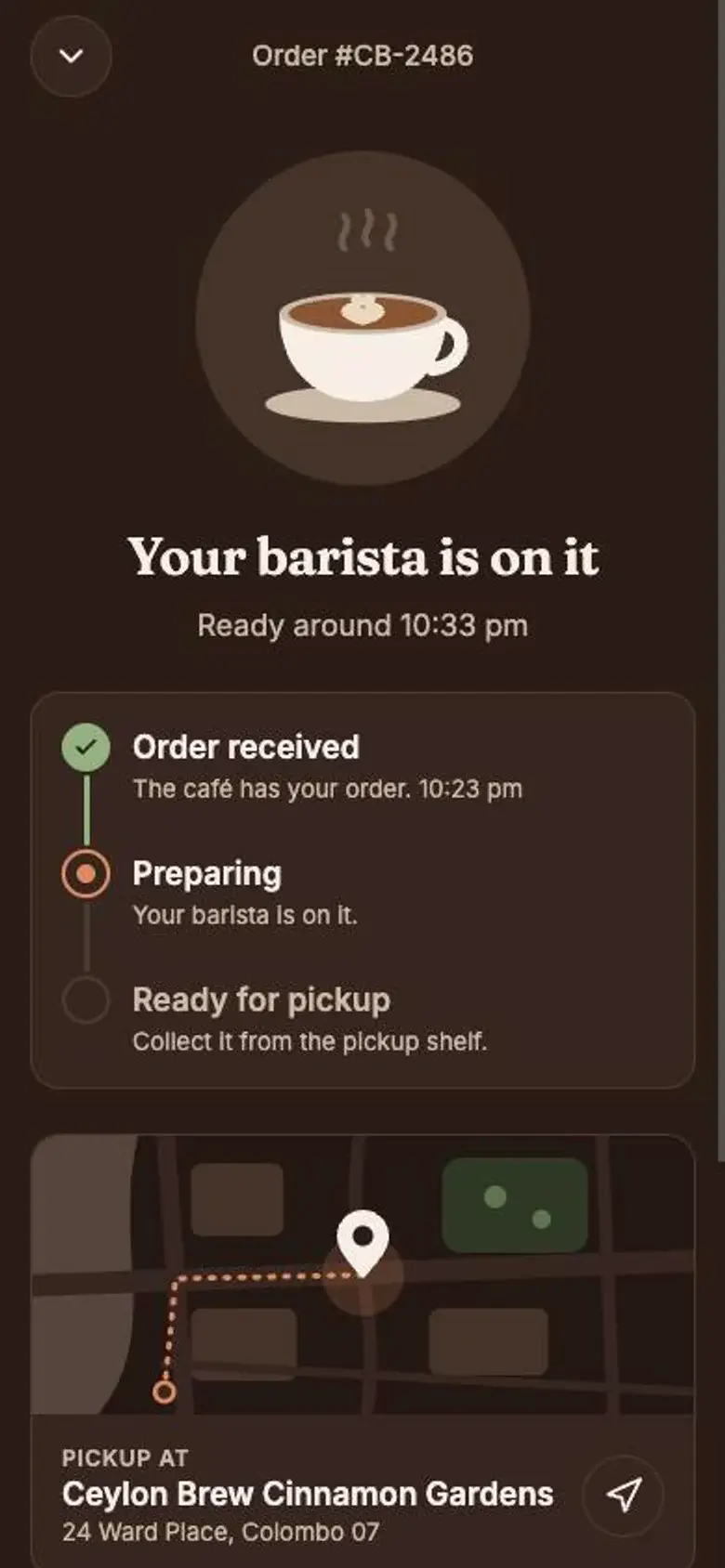
People don't mind waiting a few minutes if they know how long. A live status with a ready time removes the hovering at the counter.
- 4
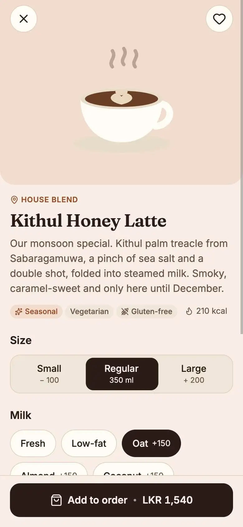
Customising a drink (size, milk, sugar, extra shot) needs to update the price as you go, or people abandon at checkout.
Approach
Our approach
- 01
Home is built around habit: your loyalty ring, then one-tap reorders of what you had last time, then the seasonal special.
- 02
Every drink can be customised (size, milk, sugar, extra shots) and the price updates as you go, worked out in whole rupees, never floats.
- 03
A live tracker takes the order from received to preparing to ready, with the pickup café on a map, so nobody hovers at the counter.
- 04
A small design system — colour tokens for light and dark, an 8pt grid, 16px corners and borders instead of shadows — keeps every screen consistent.
- 05
Every text colour pair is checked against WCAG AA by a script, in both light and dark mode, and every touch target is at least 44pt.
Screens
App screens
Home
Menu
Drink detail
Rewards
Order tracking (dark mode)
Palette
Tea green
#5E7B4C
Cinnamon
#C4693D
Oat
#E8DCCB
Roast
#2B1D16
Display
Fraunces
Body
Inter
Design decisions
Design rationale
Roast, oat and cinnamon
A palette taken from coffee itself. Cinnamon is too light for small text, so a darker version is used for text — and a script enforces it.
Fraunces for warmth
A soft serif for greetings and drink names makes the app feel like a café, not a bank. Inter handles prices and UI.
Illustrations, not photos
16 flat SVG drink and bake illustrations keep the app light, fast and consistent across every menu item.
Dark mode that still feels warm
Dark mode uses the roast brown as the background instead of pure black, so evening orders feel cosy, not clinical.
What we built
Key capabilities
01
Order ahead
Pick a café and a pickup time, pay in the app and collect from the pickup shelf.
02
Loyalty & tiers
Stamps towards a free coffee, points on every order and three tiers: Bean, Roast and Reserve.
03
Live order tracking
Received → Preparing → Ready, with the café's location and directions.
04
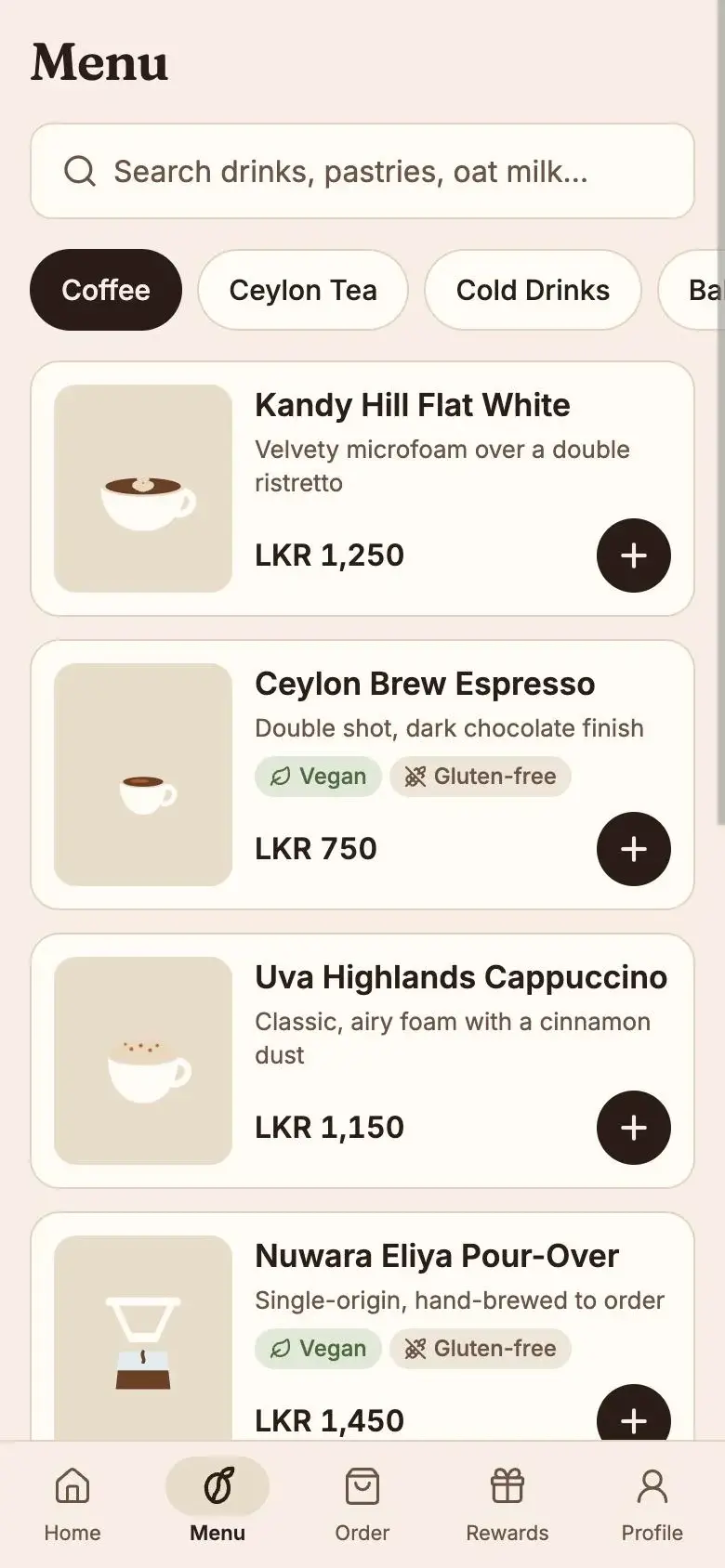
Menu with filters
24 drinks and bakes with vegan and gluten-free tags, search and categories.
05
Phone sign-in
One-time code sign-in, no passwords, then straight back to your order.
06
Light and dark mode
Every colour pair checked against WCAG AA in both themes by a script.
Results
Delivered outcomes
- A working app with onboarding, sign-in, home, menu, drink customisation, cart, checkout, live tracking, rewards, café finder and profile.
- A static marketing site with phone mockups built from real screenshots of the app.
- A clear path to a real backend: every screen talks to one API layer, with a documented plan to swap the mock data for Supabase.
Lessons learned
Designing and building together pays off: small details like the price updating as you customise only work when the design and the code are planned as one.
Accessibility checks are easiest when they're automatic. A contrast script caught problems no one would have spotted by eye.
Self-initiated build: the application is fully functional; the café brand and its details are illustrative.
Next project
05 / Brand identity & website design
Ratna & Co.