A design concept for a family gem dealer selling to buyers abroad: a new identity and an online showroom where every stone shows its lab certificate before its price.
Client
Ratna & Co. Gem House
Location
Ratnapura, Sri Lanka
Year
2026
Role
Brand identity, UI design
Services
Brand identity, Logo design, Website design, Brand guide
3
Generations
1st
Certificate, then price
45°
Monogram grid
Overview
Project overview
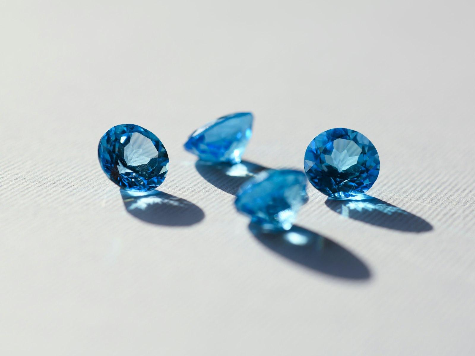
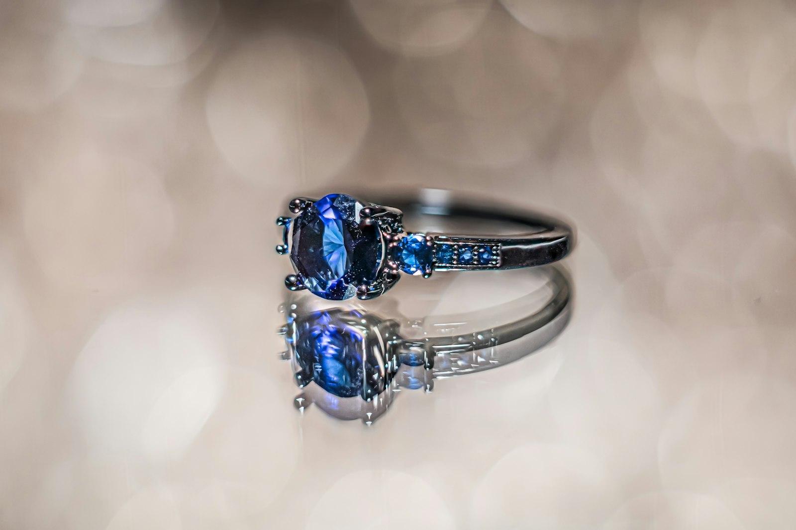
Ratnapura — literally 'city of gems' — has supplied sapphires to the world for centuries. Ratna & Co. is a concept for a three-generation family gem house in the town that wants to sell directly to buyers in Europe, the Middle East and Asia, instead of only through middlemen.
The challenge is trust. Buying a gemstone online, from another country, is a big decision, and the market is full of synthetic and treated stones sold as natural. We designed a restrained brand identity and an online showroom where proof comes first: the laboratory certificate, the origin and any treatment are shown before the price.
This is a design project: the identity, brand guide and website were designed in Figma and have not been built.

The challenge
Business challenge
Overseas buyers are wary of buying gems online. The gem house had three generations of reputation in Ratnapura, but nothing online that showed it — just WhatsApp photos and word of mouth.
Goals
- 01
Create an identity that feels established and trustworthy, not flashy.
- 02
Put proof first: certificate, origin and treatment status on every stone, above the price.
- 03
Replace 'add to cart' with private viewings for high-value stones, so buyers can see a stone in daylight before committing.
- 04
Give the family a simple brand guide they can use for certificates, packaging and social media.
Audience
Who we designed for
Overseas private buyers
Buying a special stone for an engagement ring or a collection. They need proof and reassurance before price.
Jewellers and designers
Sourcing certified stones for their own pieces. They want specifications, sizes and quick answers.
Collectors
Know exactly what they're looking for — unheated Ceylon sapphires, padparadscha — and want detail and provenance.
Research
Key insights
- 1
Serious buyers look for the lab report first. If it's hidden or missing, they leave.
- 2
'Unheated' and 'natural' are worth a lot in the gem trade, so treatment status must be stated plainly, never implied.
- 3
High-value buyers rarely check out online. They want to talk to a person and see the stone on video, in daylight.
- 4
Luxury brands signal quality with space and restraint. Glitter and sparkle effects make gems look cheaper, not more precious.
Approach
Our approach
- 01
A restrained identity: a sapphire-cut monogram, an ivory ground and a single gold line. Luxury through restraint, not glitter.
- 02
Product pages put the lab certificate, origin and treatment status above the price.
- 03
Private viewing requests replace a cart for high-value stones, with video calls booked from the page.
- 04
A short story section about the family's three generations in Ratnapura, with real photos of the town, gives the brand its roots.
Screens
Stone detail
Mobile home
Palette
Sapphire
#1E3A8A
Old gold
#B8924A
Ivory
#ECE5D6
Ink
#14161F
Display
Cormorant
Body
Inter
Design decisions
Design rationale
A monogram cut like a stone
An 'R' inside a step-cut outline, drawn on a 45° grid like a real emerald cut. It works on a certificate seal, a ring box and an app icon.
Sapphire and old gold
Deep sapphire blue for the brand, a muted old gold for single fine lines, and an ivory ground. Never more than one gold line per view.
A classical serif
Cormorant gives an established, editorial voice; Inter keeps specifications, certificate numbers and prices precise.
Square corners
Unlike most of the web, buttons and panels have square corners, echoing the clean facets of a step-cut stone.
What we designed
Key capabilities
01
Monogram and wordmark
An R cut like a step-cut sapphire, built on a 45° grid.
02
Certificate-first pages
Lab report, origin and treatment status, before the price.
03
Private viewings
Book a video call to see a stone in daylight before buying.
04
Brand guide
Logo, colour, type and photography rules in a short PDF.
05
Stone finder
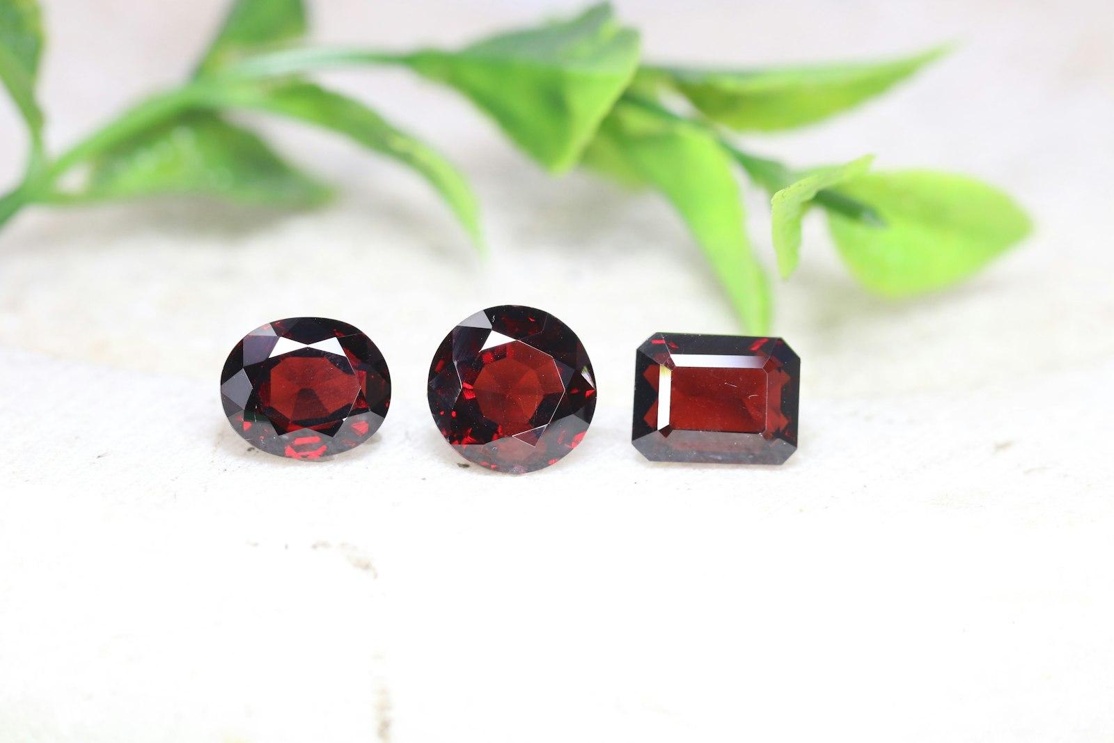
Filter by gem type, colour, carat, shape and treatment, with sizes shown on a ring for scale.
06
Bespoke service
A guided enquiry for custom rings and settings, made with a partner jeweller.
Deliverables
Project deliverables
- A complete identity — monogram, wordmark, colours, type and stationery — and a short brand guide.
- A clickable website prototype: home, collection, stone detail with certificate, private viewing booking and the family story.
Lessons learned
For high-trust purchases, design is about removing doubt. Every element on the stone page answers a question a careful buyer would ask.
Restraint is a design decision. Saying no to sparkle effects made the stones themselves look more valuable.
Design concept: a self-initiated UI/UX study, designed and prototyped in Figma. The business and its details are illustrative.
Next project
06 / Landing page design
Pulse