A design concept for a boutique fitness studio's launch campaign: one offer, a timetable you can book from, and nothing else on the page.
Client
Pulse Training Studio
Location
Colombo 05, Sri Lanka
Year
2026
Role
Conversion design, UI design, prototype
Services
Landing page design, Conversion design, Booking flow, Ad creative direction
1
Offer
2 taps
To book a trial
0
Menu items
Overview
Project overview
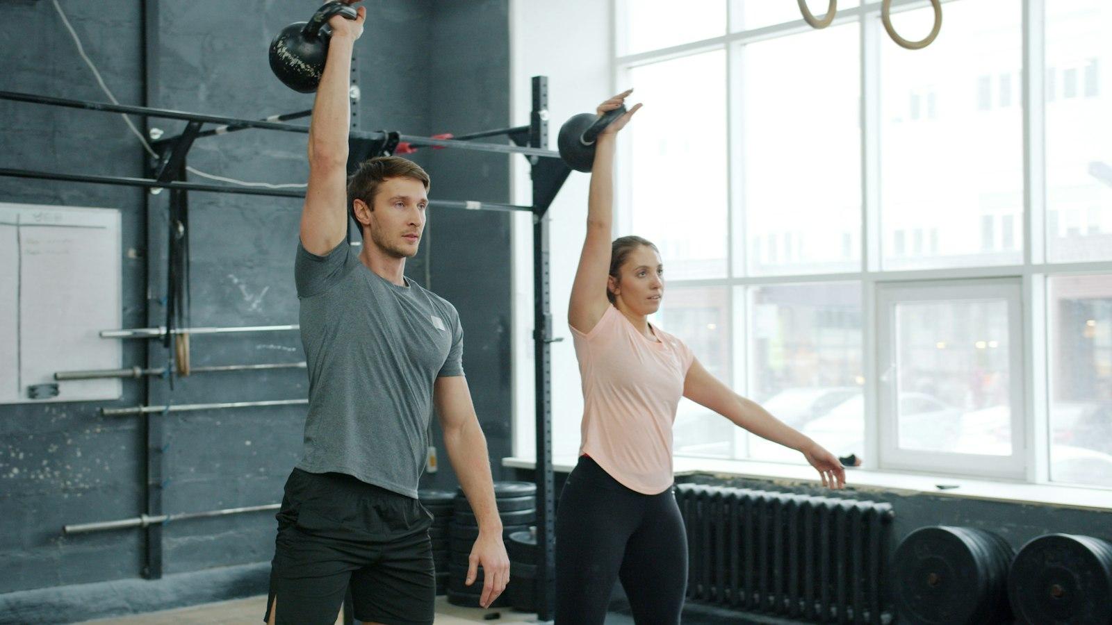
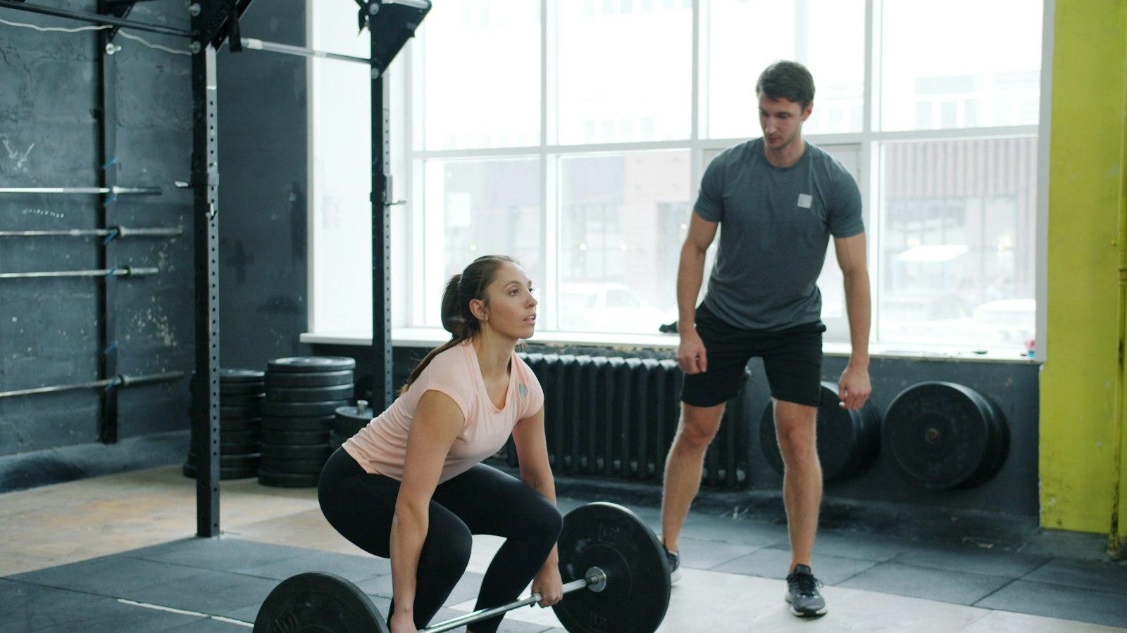
Pulse is a concept for a small-group strength and conditioning studio in Colombo 05: 45-minute classes, twelve people at most, and coaches who learn your name. For its launch, the studio plans to run Instagram and Facebook ads offering the first class free.
The problem with most fitness ads is where they send people: a homepage with eight menu items, a gallery and a contact form, where the offer gets lost. We designed a single landing page whose only job is to turn an ad click into a booked trial class — in two taps.
This is a design project, designed and prototyped in Figma, not built as a live page.
The challenge
Business challenge
Fitness studios often spend on Instagram ads that send people to a homepage with eight menu items. Most visitors leave before they ever find the trial offer they clicked on.
Goals
- 01
Match the ad exactly: the first thing visitors see is the offer they clicked on.
- 02
Let people book a trial class in two taps, without filling in a form.
- 03
Make a first visit feel less intimidating for people new to strength training.
- 04
Track every booking back to the ad that brought it, so the studio knows what's working.
Audience
Who we designed for
Curious beginners
Want to get stronger but find big gyms intimidating. A small class with a coach is exactly what they're looking for — if it feels welcoming.
Lapsed gym-goers
Used to train, fell out of the habit. A fixed class time and a coach expecting them is the push they need.
Busy professionals
Need classes before or after work, close to home, and want to book quickly on their phone.
Research
Key insights
- 1
When the landing page repeats the ad's exact words and colours, people stay. When it doesn't, they assume they've landed in the wrong place.
- 2
Forms kill trial bookings. Picking a class from a timetable and adding a phone number feels like booking, not signing up.
- 3
Beginners' biggest worry is looking out of place. Real coaches' faces and 'twelve people max' answer that better than any slogan.
- 4
Showing 'spots left' on each class creates honest urgency without fake countdown timers.
Approach
Our approach
- 01
One page, one offer: the first class free. The button repeats at every natural stopping point.
- 02
The timetable is on the page, so booking a trial means picking a class, not filling in a form.
- 03
Bold type and one hot colour, to match the energy of the ads people clicked.
- 04
Coach profiles and a short 'what to expect' section answer the beginner's questions before they need to ask.
Screens
Timetable
Mobile
Palette
Pulse orange
#FF5A1F
Chalk
#F5F5F2
Rubber
#1E1E21
Iron
#F5F5F2
Display
Archivo Black
Body
Inter
Design decisions
Design rationale
Black and one orange
A near-black background with a single hot orange for every action. On a dark Instagram feed, the ad and page feel like one continuous thing.
Heavy, condensed headlines
Archivo Black in capitals gives the page the energy of a gym wall; Inter keeps class times and details easy to read.
No navigation
The page has no menu at all. Every link either books a class or scrolls to the timetable.
Real people, real effort
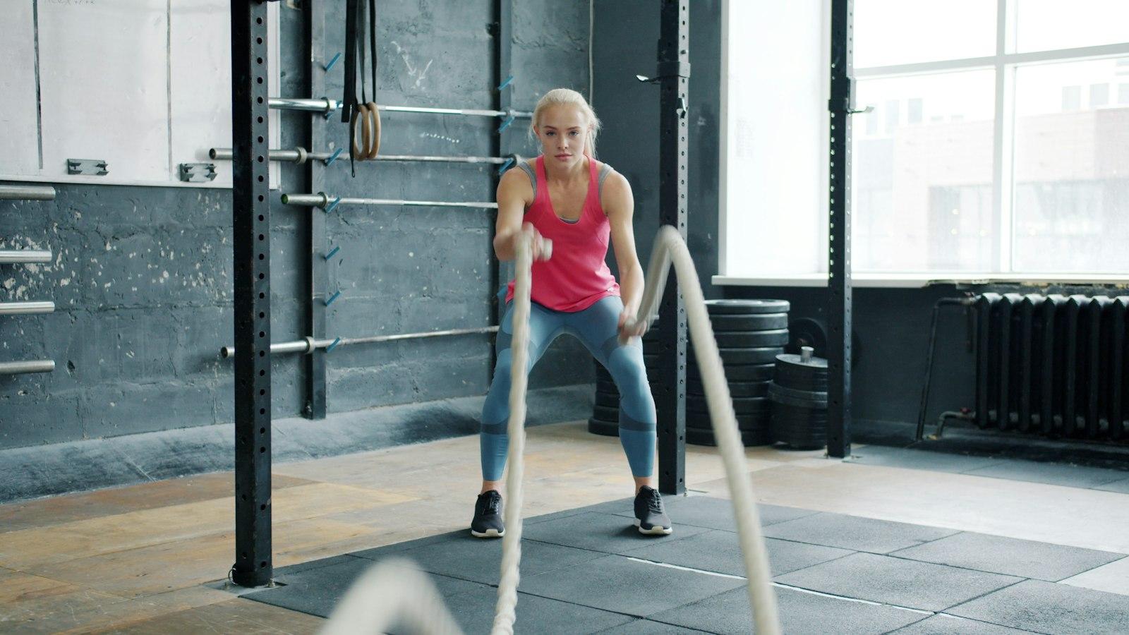
Photos show ordinary people mid-workout with a coach nearby, not models posing, so beginners can picture themselves there.
What we designed
Key capabilities
01
Single offer
First class free, stated once at the top and repeated beside every timetable slot.
02
Bookable timetable
Tap a class, add a phone number, done.
03
Coach profiles
Short, human intros for each coach, so the first visit feels less daunting.
04
Campaign tracking
Analytics events on each booking, so the ads can be judged by bookings, not clicks.
05
What to expect
What to wear, when to arrive and what happens in your first class, in five short lines.
06
Honest spots left
Live class capacity, shown only when it's genuinely filling up.
Deliverables
Project deliverables
- A clickable mobile-first prototype of the landing page, timetable and booking confirmation, plus a desktop version.
- Matching ad creative directions, so the ads and the page look and read as one campaign.
Lessons learned
A landing page is judged by one number. Removing everything that doesn't help that number is the main design work.
Energy and friendliness aren't opposites: bold type can still say 'beginners welcome'.
Design concept: a self-initiated UI/UX study, designed and prototyped in Figma. The business and its details are illustrative.
Next project
01 / E-commerce website
Thusitha Pharmacy