A full online store for a family pharmacy in Ratnapura: customers order medicines in English or Sinhala, upload a prescription from their phone, and a pharmacist approves it before anything is charged.
Client
Thusitha Pharmacy
Location
Ratnapura, Sri Lanka
Year
2026
Role
Product design, full-stack development
Services
Web design, Full-stack build, Admin dashboard, SEO setup
2
Languages
6
User roles
360px
Designed from
Overview
Project overview
Thusitha Pharmacy is a licensed, family-run pharmacy in Ratnapura. Most of its customers are regulars who phone in an order or send a photo of a prescription on WhatsApp, and the counter staff piece it together by hand. That works for a handful of orders a day, but it doesn't scale, and it gives customers no way to see prices, stock or the status of their order.
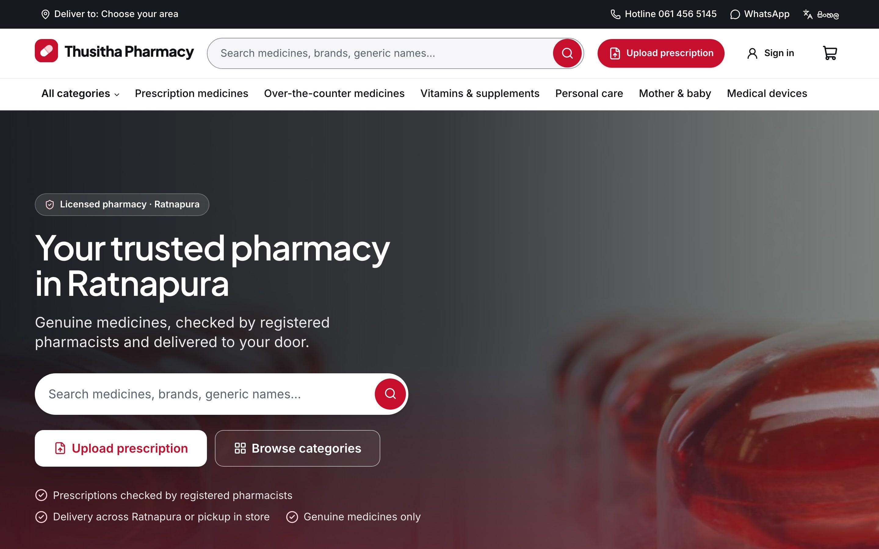
We designed and built a complete online pharmacy around how the counter already works. Customers can browse the full catalogue, search by brand or generic name, upload a prescription and pay online or on delivery. Behind the storefront, pharmacists, staff, riders and content editors each get their own admin tools.
The whole site works in English and Sinhala, is designed for a 360px Android phone first, and treats prescriptions as private medical records: stored in a private bucket, shown only to pharmacists through short-lived links, and logged every time they're viewed.
The challenge
Business challenge
Thusitha Pharmacy wanted customers outside Ratnapura town to order from them without a phone call. The hard part was prescriptions: every Rx item had to be checked by a pharmacist, and card payments could only go through once that check passed.
Goals
- 01
Let customers order any over-the-counter product online, in English or Sinhala, from a basic Android phone.
- 02
Make prescription orders safe: nothing that needs a prescription leaves the shop until a pharmacist has approved it.
- 03
Never charge a card for medicine that might be rejected — hold the money, then capture only what was approved.
- 04
Give each member of staff only the tools their role needs, with an audit trail for every sensitive action.
Audience
Who we designed for
Regular customers
Often older, often unwell, frequently ordering for a parent or child. They need large text, plain language and very few steps.
Pharmacists
Need a clear queue of prescriptions to review, a good image viewer, and a fast way to approve, reject or ask for clarification.
Counter staff and riders
Need to pick, pack and deliver the right batch of stock, and update the customer at each step without making phone calls.
Research
Key insights
- 1
Most prescription photos arrive as phone pictures: tilted, dark, sometimes several pages. The upload had to accept multiple images, fix rotation and strip location data automatically.
- 2
Customers trust a pharmacy they can call. The hotline and WhatsApp number sit in the header on every page, not hidden in a footer.
- 3
Medicines expire. Stock has to be tracked per batch and per branch so the oldest stock is always sold first.
- 4
Many customers switch between English and Sinhala in the same conversation, so the language switch is one tap and remembers their choice.
Approach
Our approach
- 01
We mapped the real counter workflow first: who checks a prescription, when stock is reserved, when a rider is called. The website follows that order exactly.
- 02
Card payments are authorised at checkout and only captured after the pharmacist approves the prescription. A rejected Rx releases the hold automatically.
- 03
Everything is designed for a 360px Android screen first, in both English and Sinhala, with 44px tap targets, a visible focus ring and plain language.
- 04
We built the design system before any page — colour tokens, type scale, spacing and every component on a style-guide page — so the storefront and admin stay consistent.
- 05
Every rule that matters (prices, stock, the Rx gate, maximum quantities) is enforced on the server and covered by tests that try to bypass it.
Screens
Prescription upload
Mobile home
Palette
Pharmacy red
#D7262E
Maroon
#7A1018
Blush
#FBEDEE
Ink
#1A1416
Display
Bricolage Grotesque
Body
Inter
Design decisions
Design rationale
Red, but never alarming
The brand is red and white, with a capsule logo instead of the protected Red Cross emblem. Errors use a darker maroon with an icon and words, so red never means 'something is wrong' on its own.
Badges that don't rely on colour
'Rx required', 'In stock' and 'Low stock' always combine colour, an icon and text, so they work for colour-blind customers and on cheap screens.
One primary action per screen
'Upload prescription' is the one red button in the header. Everything else is a quieter secondary style, so customers always know where to tap.
Fast on slow data
Pages are pre-rendered and stream in, product images are compressed, and the cookie banner is server-rendered so it never delays the first paint.
What we built
Key capabilities
01
Prescription upload
Photo or PDF from the phone camera, stored privately and only visible to pharmacists through short-lived links.
02
Pharmacist review
A review queue with approve, partially approve, ask for clarification and reject. Every decision is logged.
03
Bilingual storefront
English and Sinhala on every page, including order emails and status updates.
04
Branch inventory
Stock per branch with batch and expiry tracking, so the oldest stock leaves first.
05
Delivery tracking
Clear order status from placed to delivered, with rider assignment in the admin.
06
Staff roles
Separate access for admin, pharmacist, staff, rider and content editor.
07
Search that forgives typos
Search by brand, generic name or tag, with 'did you mean' and a request-a-medicine form when nothing matches.
08
Four ways to pay
Card (authorise then capture), PayHere, bank transfer with slip upload, and cash on delivery.
Results
Delivered outcomes
- A complete storefront, checkout and admin, built in eight phases from plan to security hardening, each reviewed before the next began.
- Prescription orders can no longer leave the shop without a pharmacist's approval — the rule is enforced on the server, not just hidden in the interface.
- Staff can see stock per branch and batch, assign riders and update customers by email and SMS without picking up the phone.
Lessons learned
In healthcare, the safest design is the one that mirrors the real process. Inventing a 'better' flow would have meant staff working around the website.
Accessibility helped everyone: the large text and simple steps designed for older customers also made the site faster for regular ones.
Next project
02 / Hotel website design
Mist & Pine